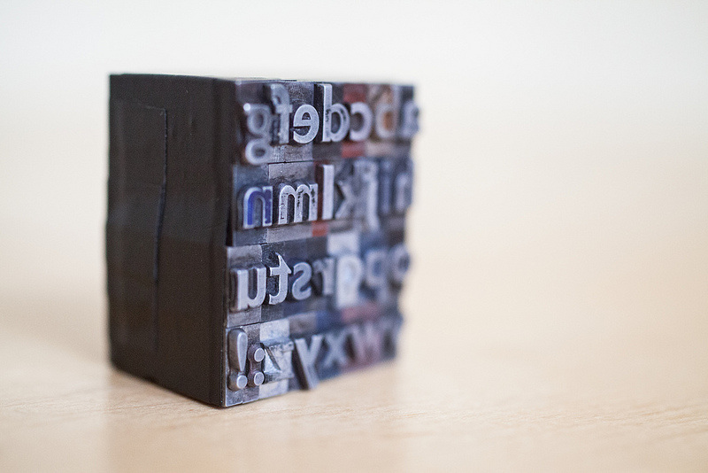
When tasked with writing a CV, more often than not, many will turn to Google for help. The sheer amount of information and tips an online search throws out is overwhelming (yes, ours are there too). Various and conflicting opinions are offered, however, the good news is that there isn’t one definitive correct CV format or presentation style (albeit there are several best practices). One of the more personal decisions to make is CV font size and the choice of font. With a myriad of fonts now available, it could arguably be a prime opportunity to differentiate your application and help get you noticed. Anything that makes a CV more human and less like a job description is usually a good thing, however showing your fun personality through comic sans is ill advised. Your CV acts as a first impression to a prospective employer. The effect of font is subliminal, whole studies have been conducted on the psychology of typeface. Font is the sartorial correctness of the alphabet, just as dress code for an interview, font should be appropriate and convey the right image.
Font falls into two main categories, serif and sans serif. The first being a more traditional decorative style, the second is simpler version. The most well known serif is Times New Roman and whilst traditionally considered safe, it now feels antiquated. Garamond and Georgia are good alternatives as they are still classic, but not overused. Cambria, a Microsoft ClearType, is a newer traditional type also worth considering. For a far more modern professional statement, choose a sans serif. The most popular (some would say banal) font in this family is Arial. Calibri has a similar, yet less ubiquitous feel, Gill Sans says ‘classic British’, or you could opt for Helvetica, the designers’ choice.
Having chosen your font, keep your CV presentation simple, consistent and avoid colour. Be selective with bold type, keep the body text to a font size 10 or 11, sub headings work well in a size 14 and size 22 is a good choice for your full name. CV font size is important, as it helps the reader review your details with ease.
Just remember though, however sharp your CV looks, it’s the content that really matters.

